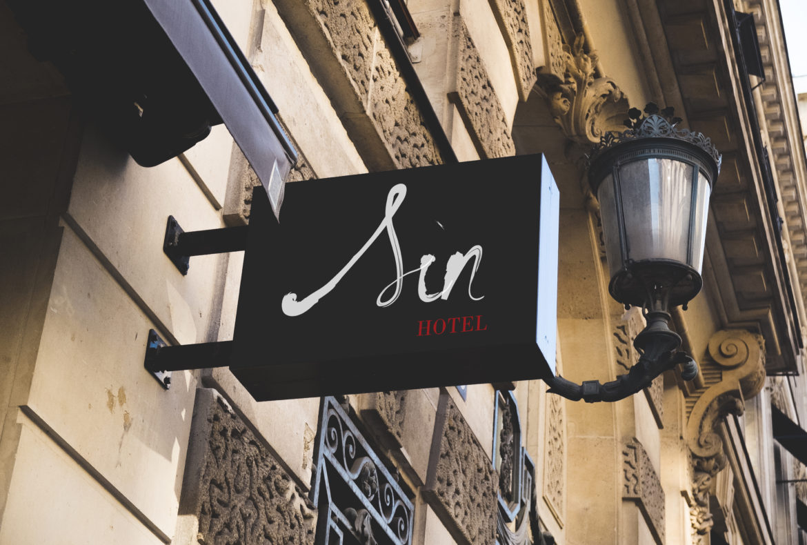
Sin Hotel
Brand Strategy - Art Direction
A definite experience when you go on a trip is staying at a hotel, and what do they usually look like? I see white walls, white sheets, and fancy lobbies. A place to stay while you enjoy everything else the city has to offer. But why can’t it be more?
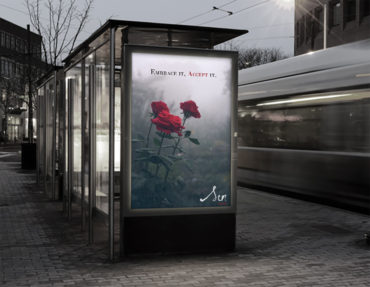
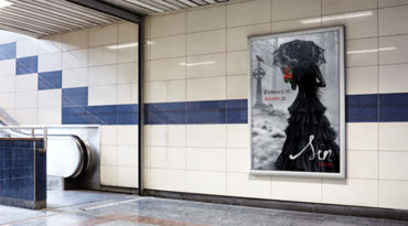
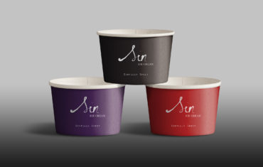
I want people to be able to experience something new, take on new perspectives, and feel accepted even though they are away from home. Sin Hotel’s core concept is to challenge what is ‘socially’ accepted. It is meant to be the opposite of what you usually see as service for the general public. Gothic themed rooms, black ice-cream, and in-house tattoo parlor for anyone who wants to express themselves.
It is a brand built on acceptance and openness to individuality, encouraging us to be passionate and accepting of who we are. I chose the name Sin because I want people to take a second look before they judge what they don’t understand.


